One of the pleasures of ski travel is meeting interesting people. A ten-day ski holiday last year in Andermatt, Switzerland proved the case: I skied and hung out with like-minded fun characters that I met at the Free rider´s Lodge where I stayed during my visit. Among them was Patrick Bonato, an Austrian living in Switzerland who was there skiing with his brother Philipp.
Patrick works as a graphic designer and illustrator and I also learned that he had been responsible for making the graphic designs for the famed freeride line-up of Völkl from early to late 2000´s. To me this was really interesting; skis like the Gotama, Sumo, Sanouk, Katana and Mantra were pretty legendary – both in how they skied and how they looked. The Asian theme with refined and even experimental designs helped solidify the position of Völkl´s freeride line-up as must-have gear amongst free riders during the early 2000´s. So after the ski vacation I decided to interview Patrick on ski designing in general and his work at Völkl.
BACKGROUND
Where are your roots?
I’m from Innsbruck in Austria, which is surrounded by the mountains, so I started to ski when I was like five or six years old.
Where are you living at the moment and what do you do for a living?
I live in Luzern in Switzerland at the moment. I had a job at an advertising agency, which was not too bad, but still not really fitting for me. So I quit in March (2013) and since then I’ve only worked on my own. I have a studio and I work as a graphic designer and as an illustrator.

What are the most important things in your life at the moment?
My girlfriend, my family, skiing and in general keeping life interesting, to keep curiosity in my life, not get stuck in some every day life. Always try to push yourself to search for more influences. So arts in general are also really important to me – more visual than music – I like to go to exhibitions, I check out what’s going on in the arts.
SKI DESIGN WORK AT VÖLKL
When did you start working at Völkl and how did you end up there? Did you have a plan to work in the ski industry?
I didn’t really have any plans to end up working in the ski industry. When I was younger I did a lot of sports and two sports that I preferred were basketball and skiing. And I dreamt more of designing basketball shoes and t-shirts – that was the direction I originally wanted to go to.
Some of the friends I had who were skiing a lot were also among the first to start doing freeskiing in Austria. Some of them got sponsors, and one of those guys was riding for Völkl and he just told me they were looking for new designers. This was in 2002 I think, winter 2002-2003. And when he told me that, I really wanted to design a ski and I started to do some first scribbles, which were not really good. And at that time I had no idea how to work professionally, I was nineteen. I didn’t really know what Völkl had produced before – I never even checked that.
Then I made a trip to Asia, to India and Thailand – one month in each. I was inspired by the travelling and did some Indian and Asian designs. After the trip I sent those drawings to Völkl and they really liked them and wanted to meet me. And after that my, first Gotama and Sanouk were produced (2004-2005 models). Then they (Völkl) really liked my ski designs and wanted me to do more designs.

What was your last ski season you did designs for Völkl?
The last one was the 2009-2010 season. 27 skis in that time period.
So the theme wasn’t planned by Völkl – you didn’t have a meeting where you were told that you should do designs like this now?
No, especially in the beginning, the only thing they asked for was to stay with the oriental theme. After some time I brought in a new theme, which was the street art or urban touch for the new school skis. The oriental style was then for the freeride skis only.
How did you take in the new materials or shapes in your graphic design work – how did it affect your design decisions?
I guess it made me look at the design in a different, more elaborate way. When before I focused mainly on the drawing and writings, these new options made me consider the ski as a whole, as an object. The materials and printing effects are something that gives the ski a more precious look.
What kind of printing techniques did you use – did you try out anything experimental that you hadn’t seen used in the ski industry before?How about materials?
Well, something that surely had not been done before was the leather top sheet they did on the Sumo. (2006) That idea originally came from the developers at Völkl. I then wanted to make the ski (Sumo) with the look of a luxury car, with a font similar to the famous Pininfarina style (a famous designer at Ferrari and other companies), out of chrome, have a three-dimensional shiny logo on it and sidewalls of mahogany wood.
Those ideas were obviously way over the top and couldn’t be realized because of production costs. They (Völkl) really tried out a lot of stuff with snowboarding. The snowboard design was always like a little bit advanced. For example, they had these boards that were made of wood (the top sheet) and the logo was actually burned right on the wood – like literally burned. They also wanted to have that on the skis, so a year later we tried that (Sanouk 2006).

How was the design work as far as the work calendar goes – when did you have to hand over the new designs for the next season’s skis?
I always did them during the winter, I’m quite sure I did them two years before they were released on the market. So they (Völkl) had one year to do the shoots for brochures and stuff, then they presented them at ISPO (sports fair) as next seasons skis. So I did the skis in like 2003 and they were on the market for the 2004-2005 season.
GOTAMA – THE BIRTH OF A CLASSIC
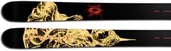
When the Gotama was introduced in the late nineties it was a strikingly unique looking ski with its relatively fat size, twin tips and surfboard-like simplistic graphics with a Buddha character.
Did you see or ski the first Gotama model before you started designing the graphics for the Gotamas yourself and what did you think about the design?
I first saw it when I had my design already done. At the time I was not that convinced about it – I was not that big of a fan of simple designs. I started to like them when I got a little bit older; at that time I thought it was a little bit boring actually. Now I think it was not that bad.
I guess when you look at the actual graphic design, there is not much to it: it was a black ski with a very small Buddha.But what made it so unique-looking at the time was that people were used to skis with huge company logos and model names with bright colors – it was really different.
Völkl was really cool with that – for every model I made I designed a new Völkl logo. The letters and the logo stayed the same, but I made it with a brush one year, with a pen the next year and another time I made just like scratches, and that became the logo. There was not this old-fashioned thinking of putting your brand on it; like that the logo would have to be the same every time.
The first letterings I did weren’t even readable – or at least you Couldn’t read them well. They were influenced a bit by graffiti also, so it took some exercise to be able to read them. Haha Anyway, Völkl liked them and they didn’t care that much about it, which was a really good approach I think. Not to make the graphic designer use it (the ski) as an advertising tool, it’s not an advertising tool anymore – it’s the ski you love and want to ride with. If it’s good looking and if it’s a good ski people will know what brand it is anyway.

THE ORIENTAL THEME
The oriental theme that started with the first Gotama has served Völkl well, it gave them a strong brand identity, way before the other ski manufacturers started to use a theme for a whole line-up (except maybe for K2), and during the years some manufacturers have even copied it.
Was there a clear plan at Völkl to use the oriental theme for the whole freeride line-up or did it just happen by accident after the first Gotama?I remember there was some other imagery there as well, like the wizard on the Explosive.
It was obvious; to them it was really clear that we should do the whole free ride line-up with this one topic. I mean there are a lot of possibilities with this (oriental) topic: you can pick the samurais, the religion or whatever, you know. Something Like the Chopstick – when that came up, it was still oriental, but totally different: trashier, more contemporary. To me, it was just fitting as a story. I didn‘t look at it from a marketing perspective. For Völkl it was clear too, so there wasn’t even that much talk about it.
What about the other brands who were copying the oriental theme – how did Völkl react to this? What did they think about it?
We never really talked about it, but I had the impression they didn’t care too much. And in my opinion, they didn’t have to. The copy couldn’t compete with the original in these cases.
After all these years Völkl is still using the oriental theme for most of their freeride line-up, do you think Völkl will keep the oriental theme or do you think they have to come up with something new in order to stay fresh?
If I were still working for Völkl I would prefer to do something else after all those years, because I think – especially for the Gotama – it’s hard to find something new for the Buddha all the time. I don’t know how long they will stay with this theme.
If you look at the Völkl free ride line, even the model names are oriental.
That’s one reason they stuck with it, because it’s hard to rename a successful ski.
DESIGN PRINCIPLES AND EXPERIMENTATIONS
Was it ever difficult to come up with a graphic design for a ski?
Yeah, it was. I mean I put a lot of pressure on myself: if there was a ski to be done, I wanted it to be really good. So I worked a lot on them. Some of those skis were quick – some of them were easy work: I had a good idea, I just made the drawing and it came out well. And it was done in like 2-3 days, but more often it was really a lot of work.
And it was never easy to find the right idea, the right composition. The shape of the ski is challenging, it’s two very long and narrow strips. I mean, even if it’s a really fat ski, the format is still very difficult to handle. I think something that wasn’t seen a lot when I started was the design continuing from one ski to the other. I’m not sure if I was the first one to do it.
Do you have a favorite model among the skis you did?
Yeah I have a favorite: it’s the first Chopstick that ever came out in 2008. Graphically and idea-wise, it’s a ski that I still really like. It’s sushi from above and you see hands and feet grabbing stuff from the plates. I just started playing with that and put stupid stuff on the plates you know. In the beginning there was even a panda bear, but Völkl didn’t want that.

THE RISE OF THE NEW INDEPENDENT SKI MANUFACTURERS
Have you followed the rise of the small independent ski manufacturers during the recent years?What do you think about the graphic designs and ideas in skis these days?
It’s hard for me to judge that really, because I don’t follow everything that’s happening. From what I see there are still a lot of good things happening, but it’s also visible that it’s not as free as it used to be. It’s not that playful anymore, they know more what they’re doing – they’re not trying out that much anymore. It’s always the ones who are – let’s say avant-garde – they try stuff that no one has tried before and the others are following – copying. And they (the copy cats) never create something really successful design-wise.
But something that I’ve seen recently and was really new to me was the brand Black Crow. They came up with some really 80’s influenced designs: technical with sharp contrasts – and that was something really new then. It was not a new design, but it was new in freeskiing and I see now that a lot of the other companies are copying it too. That’s what I meant by saying that they are not trying out new things anymore, but it’s become hard to come up with something fresh.
How would you like to see designs on skis evolve – what would you change in today’s ski graphic trend?
Wow, that’s a hard question. I think the way I work has also changed a lot in ten years since I started working with Völkl. I have to think what kind of design I would like to put on a ski nowadays. But I’d like to have some concept behind it, I always like to work with a concept, an idea – rather than just making something visually nice.
Is there a chance you would work for ski graphics design again?
Yeah, I’d like to do it again now that I’ve had a break for a few years – that was important.


Photos in this story by Patrick Bonato and Völkl skis.
My story on Patrick´s work with Völkl free ride skis first appeared in 2014 on the web edition of Downdays Magazine: http://freeski.downdays.eu/magazine/ and in the Finnish Edge ski Magazine: http://www.krookmedia.fi/?page_id=27
SaveSave

Hello!
Your article is very interesting, thanks for the information!
In France, there is some beautiful mountains for freeride !
I wrote an article about PIC DU MIDI and ski on my site: https://activityguideoperal.wordpress.com/2016/12/27/pic-du-midi/
Best regards,
Catherine
Hi Catherine,
Thanks for your comment – glad you like the story!
Yes – I´ve skied quite a lot in France, there are some amazing mountains and resorts, that´s for sure! Maybe I will write a story about a French resort/region in the future.. Thanks for the tip – I´ll check out your article!